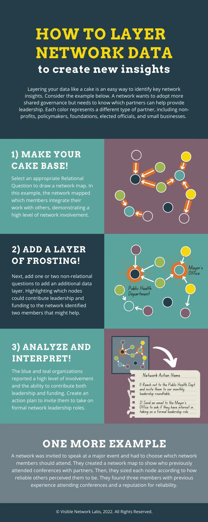
How to Layer Network Data to Generate Insights: An Infographic
This infographic shows how to analyze a network map by layering relational data and non-relational data to create actionable insights for your collaboration with community partners.
Read the infographic on our website or further below: https://visiblenetworklabs.com/2022/12/19/layering-network-data-to-create-actionable-insight
Related Articles
Access the Insights Library
The Insights Library is a new feature in the PARTNER CPRM analyzer that provides users with valuable information and resources to help interpret network data and visualizations. It offers four types of insights for various topics related to network ...Use Network Mapping
This articles shares an overview of the Network Map module within the Network Analyzer, along with best practices and tips for getting started. NOTE: Under the "Explore" tab, click "Networks" to visualize and analyze data from one network survey or ...Using Network Data to Inform Collaborative Strategy: An Infographic
This infographic shows how to use network and relational data to inform your collaborative strategy and guide how you develop and manage community partnerships Read the infographic on our website or further below: ...Edit Relationship Settings for Network Maps
PARTNER CPRM includes multiple ways to visualize and color your relationships (lines) based on their relationship data. This allows you to layer multiple types of data to identify patterns and outliers across your network. For example, you can color ...Styling Your Network Map
The PARTNER CPRM Analyzer includes multiple options for styling your network maps to give them a custom, personalized look and feel. Here are instructions on how to access and leverage our analyzer style settings. Access Styling Settings for Network ...