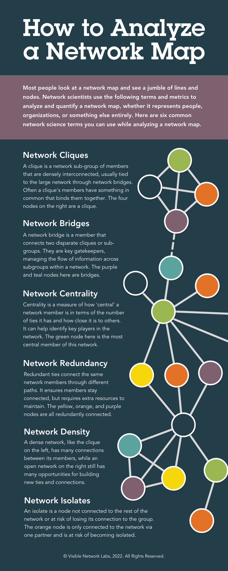
How to Analyze a Network Map: An Infographic
This infographic shows how to analyze a network map, like the visualizations created with PARTNER CPRM.
Read the infographic on our website or further below: https://visiblenetworklabs.com/2022/01/24/how-to-analyze-a-network-map/
Related Articles
How to Layer Network Data to Generate Insights: An Infographic
This infographic shows how to analyze a network map by layering relational data and non-relational data to create actionable insights for your collaboration with community partners. Read the infographic on our website or further below: ...Use Network Mapping
This articles shares an overview of the Network Map module within the Network Analyzer, along with best practices and tips for getting started. NOTE: Under the "Explore" tab, click "Networks" to visualize and analyze data from one network survey or ...Choose a Network Map Layout Algorithm
There are six different layout algorithms for visualizing nodes and edges in the network mapping module. Here is a brief overview of the options and instructions on how to change them. The Six Layout Algorithm Options in PARTNER CPRM These layout ...Video: How to Use Network Mapping
Video Tutorial: How to Use Network Mapping Learn how to analyze your data using network mapping in this PARTNER CPRM video tutorial.Hide & Display Settings for Network Maps
The hide & display settings in the network map analyzer lets you hide or display isolated nodes, node labels, and line arrowhead to simplify your network maps or add more detail. Here's how to access and use these settings. How to Access and Use ...